Assignment #1: Yin Yang
Created in Adobe Illustrator CS6

From creating my first image, I learned the basics of Adobe Illustrator CS6. I was able to adjust gradients and add more than two colors to the gradient. I also utilized the shape tools and eyedropper tool. Lastly, I learned to manipulate stroke thickness, color, and other settings within stokes.
Assignment #2: Initials
Created in AI CS6

Creating my initials in AI CS6 allowed me to use the text tool and focus on how fill/stroke thickness and color affected an image. I chose a green-blue for the "M"s with a darker blue stroke, and a pink-red fill and yellow stroke for the "Y" and "E." I wanted to make sure that the "M"s were legible while using the same color. To do so, I used tertiary colors.
Assignment #3: Flowers (Pen tool)
Created in AI CS6
Top: Original image
Bottom two (from left): Foliage, Gig Harbor High School colors
Bottom two (from left): Foliage, Gig Harbor High School colors

Copying and altering these flowers in AI CS6 taught me how to use the pen tool to trace objects and copy and paste them to where I can manipulate the paths I made with the pen tool. I also enhanced my gradient skills with the color of the flowers.
(The original is the top flower in the image.)
(The original is the top flower in the image.)
Assignment #4: GHHS Activity Logo
Created in AI CS6
Left: GHHS Logo
Right: Original image
Right: Original image

|

|
By creating the Gig Harbor High School activity logo, I learned how to put text on a stroke. I placed the "GHHS" text along the outside of the circle of the ball. I then connected the letters of the text at certain points to mesh the letters together. I chose columbia blue for the pentagons of the ball and gave the text navy blue. I also practiced my pen tool skills by tracing the soccer ball (original on the right). Lastly, I chose to put a soccer ball behind the text due to my involvement in the Gig Harbor High School soccer program.
Assignment #5: Choir Poster
Created in AI CS6

Creating the GHHS Choir poster, I learned several things. I learned how to create a visually appealing and easy-to-look-at advertisement. With this, I learned how specific font sizes, types, and colors can affect a piece's appeal and where it directs viewer's eyes. I also used multiple layers to organize my work and make it easier to edit different aspects of it. Overall, this project allowed me use my own creativity to fit the necessary requirements for the occasion and season.
Assignment #6: ASB Card 2016-2017
Created in AI CS6

Creating the GHHS 2016-2017 ASB card, I learned how to create an aesthetically pleasing and easy-to-read card. I utilized the text tool and different kinds of text to make certain parts of my card stand out. I also used school colors with certain texts to make certain texts more prevalent than others. I also used two art boards to meet the requirements of the assignment. Like always, I used multiple layers for my project to be more organized and make it easier to edit different layers. Overall, the project allowed me to use my own creativity to meet the requirements of the project.
Assignment #7: Stem Club T-Shirt
Created in AI CS6

Creating the Gig Harbor High School STEM Club T-Shirt taught me how to creatively design a legible, appealing T-Shirt based on the guidelines I was given. I utilized the pen tool, text tool, and rectangle tool to design my T-Shirt. I also used san-serif text to keep the shirt in the same text family and differentiated the different words and letters with varying font sizes and colors.
Assignment #8: Initials Logo
Created in Adobe Photoshop CS6

Creating this logo allowed me to learn the different layer effects and how they can enhance an image's depth. I also learned how to use different filters on images. I used tools such as the marque tool, direct select toll, and text tool. To create the logo, I had create a circle and distort it. I then added some effects and placed an image of nature in the silver part of the emblem and used the glass filter to give it a shiny, reflective look. The different layer effects gave the emblem its shiny and detailed texture. Overall, this project taught me how different layer effects can add detail to an image.
Assignment #9: Picture With 1000 Words
Created in PS CS6

In completing this project, I learned how to take an image and apply text to it (with the text tool), use a layer mask and other layer effects, and use the color range settings to adjust the colors to shadows and mid-tone. I also created custom brushes in order to get the words to look sporadic. I used a picture of myself and selected only myself in order to change the color range. In doing this, I could see where the shadows of my image were so I could add more if necessary. With custom brushes, I randomly placed my name all over the image. I changed the color to look like a sunset, and then added an Edgar Allen Poe poem called Romance in a different font for more dimension. Overall, this project allowed me to practice a multitude of skills, mostly layer effects
Assignment #10: Magazine Cover
Created in AI CS6

Creating this magazine cover, modeled from Hawaii Magazine, taught me different skills required in making an eye-catching, yet legible magazine cover. I utilized the text tool mostly. To get the effect I wanted, I varied text font, size, and color. In order to make the title stand out the most, I had to bring in a bright magenta color to make it the most prominent text on the cover. I used a mixture of simple serif and san-serif fonts that were relatively close in style so that it did not seem sporadic. Lastly, I took colors from the background photo using the eyedropper tool to create coherence and give the cover a natural feeling to it.
Assignment #11: GHHS Girl's Basketball Program Cover
Created in AI CS6

In completing this project, I learned how to make a legible, yet aesthetically pleasing program. I utilized the rectangle tool for the background and schedule, text tool, and pen tool for the tides logo, while also altering the font type, size, and color. I also used the rulers to determine where the center of the program was so that it would be symmetrical. The program emulates GHHS colors in addition to a pop of color from the orange basketball.
Assignment #12: Winter Choir Poster
Created in AI CS6

By creating this project I learned how to develop a winter themed poster that was interesting, yet legible. I used the rectangle tool and ellipse tool to create the background (along with gradient), snowflakes, and musical notes. I copied the snowflake and transformed it so that it was smaller and fit next to each group performing at the concert. I then used the text tool and altered the type, size, and color to emulate the winter theme and to focus the viewer on certain aspects of the poster.
Assignment #13: Girls Basketball Program
Created in Adobe InDesign CS6


By completing this project, I learned the basic functioning of Adobe Indesign, such as creating multiple amounts of pages, centering my work, creating text and boxes, and placing other images into my work. I also practiced satisfying a client's needs and working directly with them. In addition, I practiced altering text font, size, and color in order to create an aesthetically pleasing piece. Most of the time spent on this project was fitting everything evenly, and altering the text players' photos.
Assignment #14: Longboard Skateboard Deck
Created in AI CS6
Left: top
Right: Bottom
Right: Bottom
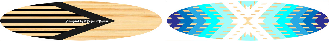
From creating this longboard design, I practiced using the rectangle tool to fabricate the arrow design, while altering the angle, shape, color, and size of the rectangle. I also used copy and paste a lot to give it symmetry. I also utilized the ellipse tool and the pen tool to create the general oval shape of the board. Lastly, I used the type tool to put my name on the top. Overall, I incorporated all of the graphic design skills I have learned to create an aesthetically pleasing longboard.
Assignment #15: Cereal Box Design
Created in AI CS6 & PS CS6

In AI CS6 I created the front and side of my redesigned Trix cereal box. I gave it a realistic look by using a cursive font with the text tool, yet kept the same look by filling it with green and giving it a white stroke like the original. I also placed a realistic image of a white rabbit to give it the realistic look, and kept the original cereal bowl, since it was already realistic. I used the pen tool and ellipse tool to give shadows to the rabbit, cereal, and give a 3D effect to the name. I also gave the shadows a gradient to create more realism. I used the rectangle tool for the lines, and the pen tool to trace the General Mills logo. In PS CS6, I distorted the images to fit onto the 3D box.
Assignment #16: GHHS Tide Pride Sticker
Created in AI CS6
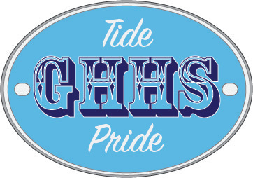
In order to create this Gig Harbor High School Tide Pride sticker, I only used the ellipse tool, rounded rectangle tool, and the text tool. I simply altered the types of fonts, stroke and fill color, and altered the color and size of the circle. The multiple circles added more detail to the edges of the sticker, and the square ovals were used for decorative purposes. I learned to create a simple, yet aesthetically pleasing sticker that I could see on the back of a car.
Assignment #17: Early Spring Concert Poster
Created in AI CS6
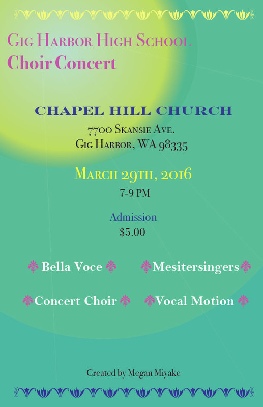
In order to create this choir poster, I got inspiration from spring's vivid colors. I used the rectangle tool to create the background, and the ellipse tool to create the sun's rays. I lowered the opacity to make it more realistic, and gave the smallest ellipse a gradient to soften the intensity so it was also a bit more realistic. I also used the line segment tool to create the small rays and gave them a lower opacity. Lastly, I used the text tool to create all of the information for the concert, and altered the font type, size and color to make certain aspects stand out.
Assignment #18: Summer Concert Poster
Created in AI CS6
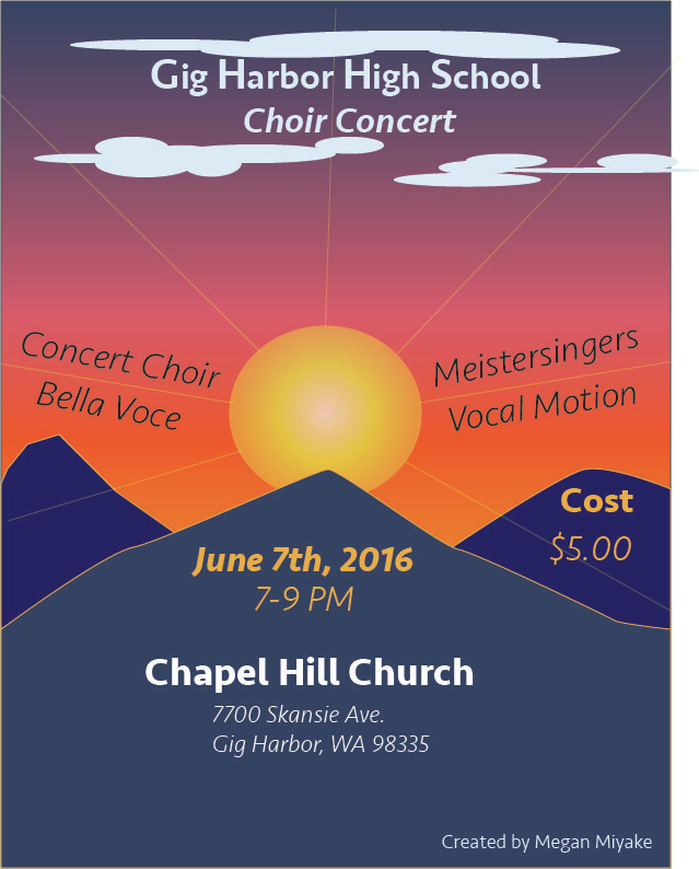
In order to create this choir poster, I used the pen tool, rectangle tool, ellipse tool, line segment tool, and text tool. The mountains were created using the pen tool; I altered the fill color and stroke color to fit the summer theme. I gave the sun (ellipse) a radial gradient to make it more realistic and give it a glowing effect. The background was also created with a gradient using the rectangle tool. The rays of the sun were done with the line segment tool and a lowered opacity level. Like the sun, the clouds are just a bunch of thin ellipses randomly placed to make them appear as clouds. Lastly, I altered the text color and the font style, but kept the same font family so it did not look too busy.
